

When supporting some of the world’s largest and most successful SaaS companies, we at Wavefront by VMware get to learn from our customers regularly. We see how they structure their operations, how they implement their monitoring and automation policies, and how they use smarter alerts to lower mean time to identify and mean time to automate. In part 1, I discussed topics such as simple vs. smart alerts, anomaly definition, metrics-based vs. logs-based anomaly detection, and the value of an expressive language for using analytics to find anomalies specific to your cloud application environment. In part 2, I covered the first set of five smart alerting examples used by leading SaaS companies, starting with the most basic – a range alert. Here in part 3, I cover the next set of five smart alerting examples to auto-detect cloud app anomalies.
6. Alerting on Group Variance
Below in Figure 1 is a similar case to example 5 from part 2 blog – Alerting on a Group Range Anomaly. But the function to expose the anomaly is different. Here, we have a load balancer supporting multiple entities. In this case, however, we don’t just care about the max versus the min. Rather, we are looking for balance. We care about the spread across all the different channels because, in case of a big spread, there tends to be too much utilization on the top and not enough on the bottom. Handling this unbalanced behavior on both sides costs extra money.
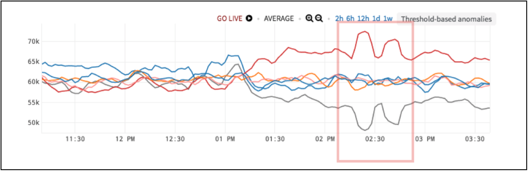
Figure 1. Load Balancer with Anomalous Behavior
So, we use variance or a square root of the variance to get the standard deviation. Below in Figure 2, the spikes are the anomaly. Normal in this situation is a low group variance. When the group variance gets too high, that is the anomaly.
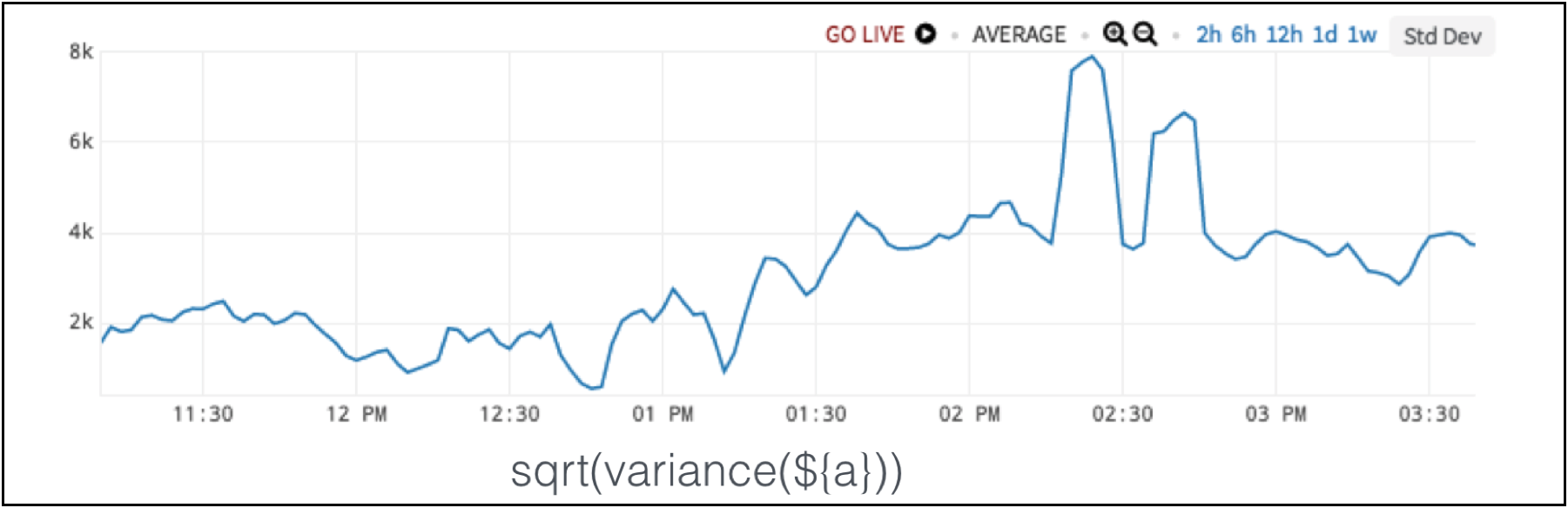 Figure 2. Standard Deviation Detects Load Balancer Anomaly
7. Alerting on Group Sum
Now, let’s say that a different team from the same company looks at the same hardware and the same chart as shown in Figure 3. This team says there’s no anomaly.
 Figure 3. Load Balancer Data
Why? This team is downstream to the whole process, and they don’t care about the internals. They see total throughput by taking the sum, and the sum is totally fine to their needs.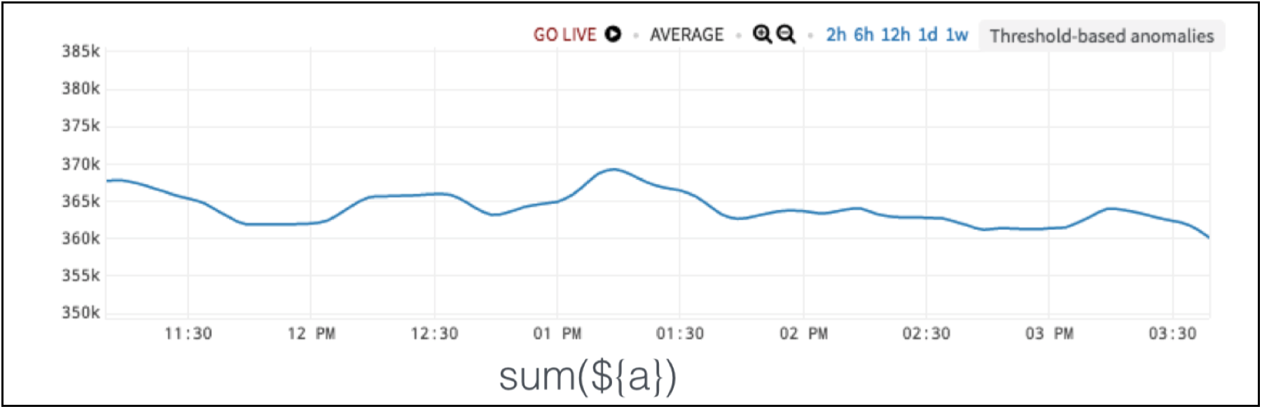
Figure 4. Load Balancer Data without Anomaly of Interest
So, anomalies are in the eye of the beholder. They are subjective and not mathematical truths. We use the language of math to express them, but we encode our own intuitions about what actually is happening. Our domain knowledge can’t be replaced. It is all about our perspective.
8. Alerting on Ratio Between Two Series – Correlation
We have a very jagged chart in Figure 5. The red box is the anomaly. So, why is this anomaly? It’s not even the highest value!
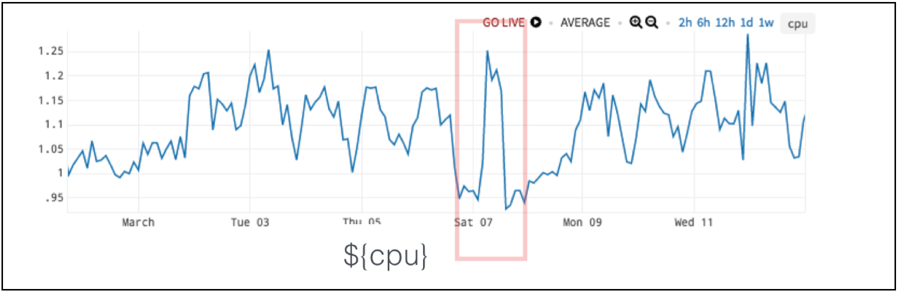 Figure 5. CPU Data with Anomaly in Red Box
Let’s show this resource metric – CPU – next to a demand metric like requests per second. These two metrics tend to go together.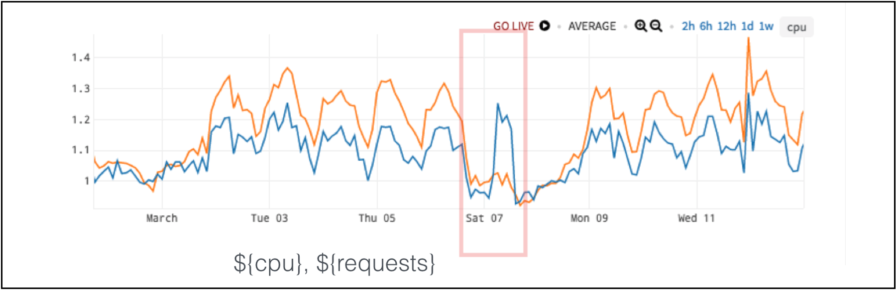
Figure 6. CPU (in blue) and Requests per Second (in orange) Data with Anomaly in Red Box
In the chart in Figure 6, for five days a week – the week before and the week after – the two metrics move very closely together. But, on Saturday, requests stay low while the CPU goes high. So, the anomaly is actually the relationship between these two metrics and not one metric by itself.
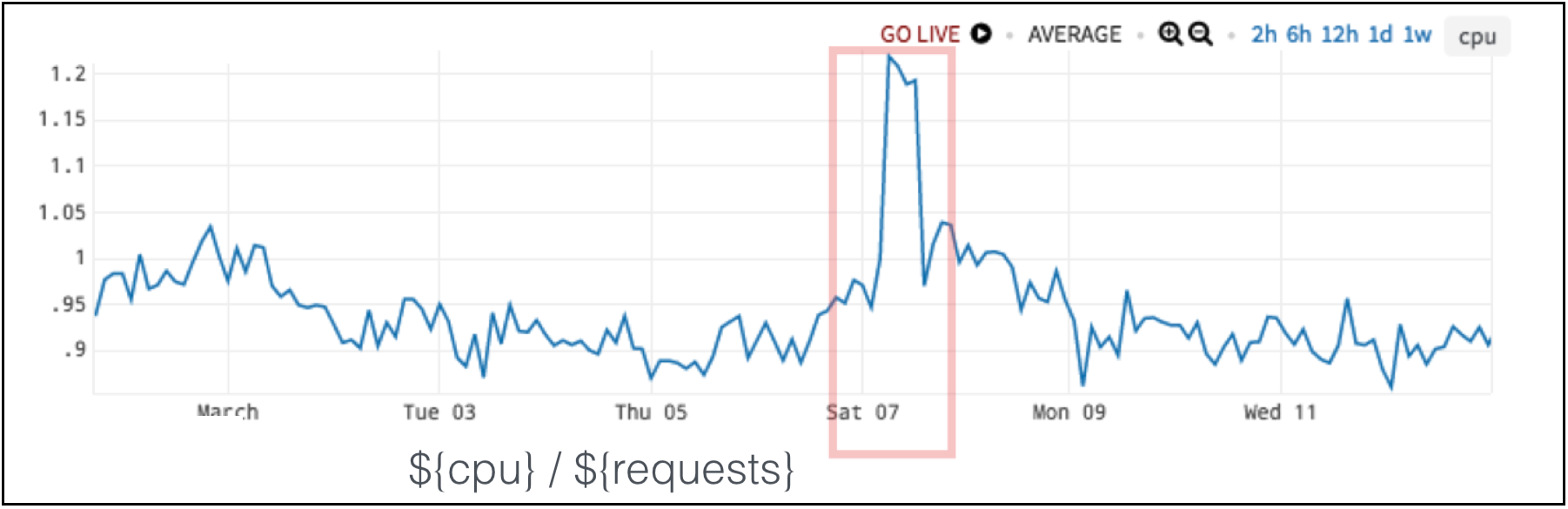 Figure 7. CPU vs. Requests per Second Ratio Detects the Anomaly
If you take a simple ratio between the two metrics, the ratio tells you when there is an anomaly as in Figure 7. A low ratio is the expected result, and a really high ratio lets us know we have unexpected behavior.
9. Alerting on Inverse Correlation
Inverse correlation is the opposite case of example 8: Alerting on Ratio Between Two Series – Correlation. In Figure 8 on the left side of the red box, the blue- and green-colored metrics don’t seem to have much of connection. However, during the anomaly, the lines in the red box inversely correlate: when blue goes up, green goes down and vice-versa.
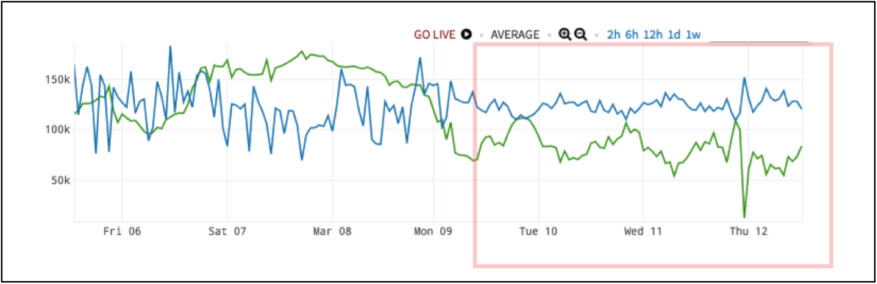 Figure 8. Shared Resource Saturation Anomaly
This is actually a very common pattern. This happens when there are two resources, here in blue and green, that have a shared resource. It could be CPU, storage, a third service – it could be anything. Typically, each resource has its own behavior based on its own incoming requests and everything’s great. However, when that third shared resource gets pegged, the other blue and green clients are fighting a zero-sum game on the shared resource: when one gets capacity, the other one loses it. This is a telltale inverse correlation.
For this problem, we use a moving correlation as shown in Figure 9. The normal range falls between – 0.5 and 0.5. When we have shared resource saturation issue, the value drops to almost – 1.
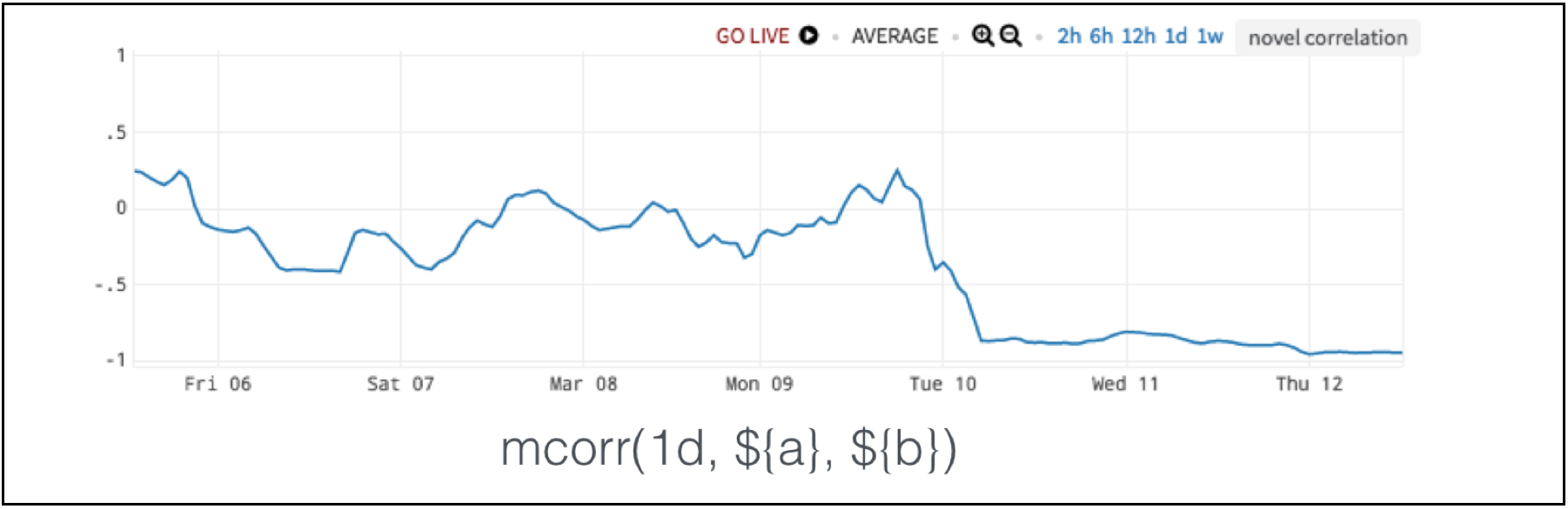 Figure 9. Moving Correlation Detects Shared Resource Saturation Anomaly
10. Alerting on Consistent Frequency
The anomaly shown in Figure 10, is pretty obvious by itself. We have missing data. We expect the data to come in at regular intervals, but it does not.
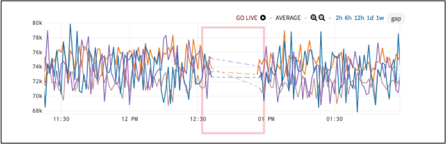 Figure 10. Missing Data Anomaly
You can simply apply a moving count which is similar to a moving average, but instead, it counts the number of points reported in a given window. Here, a consistent reporting frequency is normal, and an anomaly is when the 20-minute count drops below a certain rate.
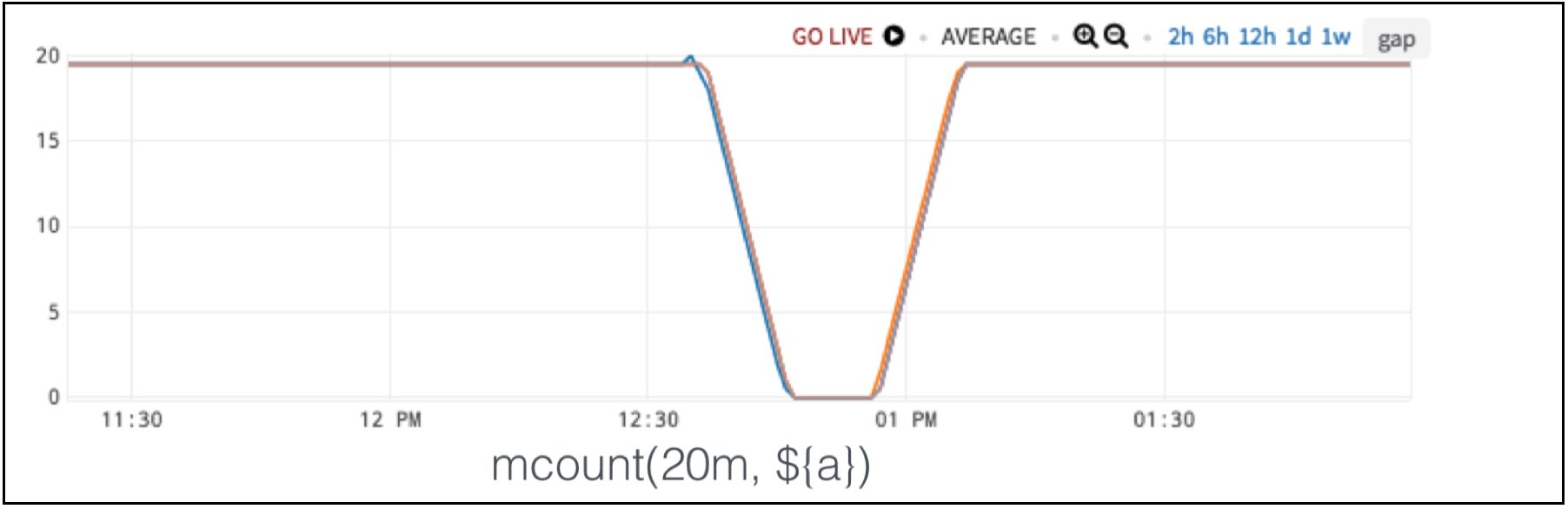 Figure 11. Moving Count Detect Missing Data Anomaly
In the fourth and final part of this blog series on auto-detecting app cloud anomalies with analytics, I will uncover the common, hidden theme amongst all discussed metric-based anomaly definitions. If you want to try Wavefront in the meantime, sign up for our free trial. Stay tuned!
Get Started with Wavefront Follow @mikempx Follow @WavefrontHQThe post How to Auto-Detect Cloud App Anomalies with Analytics: 10 Smart Alerting Examples – Part 3 appeared first on Wavefront by VMware.
About the Author
More Content by Mike Johnson


